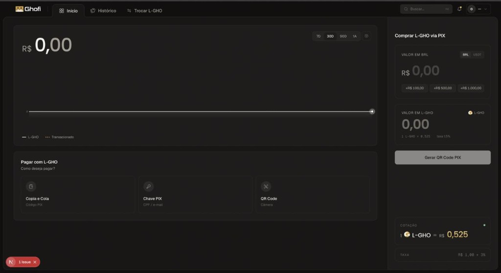
Crypto apps overwhelm newcomers with jargon, addresses, and irreversible mistakes. Akrus needed to feel as safe and obvious as sending a text message. [Replace with the real challenge.]
0%
of new users dropped off before their first transaction. [placeholder metric]
Discovery
Fear of mistakes
Users feared sending funds to the wrong address. [placeholder insight]
Jargon overload
Gas, slippage, wallets — words without meaning to most. [placeholder insight]
No feedback loop
Transactions felt like a black box after tapping send. [placeholder insight]
Decision 01
Plain-language first
Every technical term replaced with what it means to a human. [placeholder]
Decision 02
Confirm by preview
A full visual preview before anything irreversible happens. [placeholder]
Decision 03
Live status
Real-time progress so the transaction never feels like a void. [placeholder]
State 01
State 02
State 03
Process
Sketch 01
Early flow exploration.
Wireframe 02
Low-fi transaction screen.
Wireframe 03
Confirmation pattern.
Hi-fi 04
Final visual direction.
Final design
Final mockups / prototype video
Build
Figma source
Shipped product
Designed & built by me
Impact
0
taps to send
0%
faster onboarding [placeholder]
0
app store rating [placeholder]
"[Client quote placeholder — what the impact felt like from their side.]"
— Client name, Role
What I'd do differently: [placeholder reflection on what you'd improve next time.]